Bootstrap Tutorial
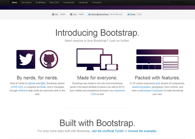
Bootstrap is a great tool to use for developing a Web site. It comes with CSS building blocks as well as useful jQuery plugins. Although I didn’t use it to build my current Web site, I did enjoy experimenting with it. I may use it more in the future as well. It’s pretty easy to use and enables you to use good naming conventions for classes, as they are already there. You can click on Getting Started to get a quick rundown.
“Sleek, intuitive, and powerful front-end framework for faster and easier web development.”
Bootstrap comes with many classes you can use that each serve a purpose and have style attributes already associated with them. For example .btn for button; if you want different colored buttons, there’s .btn-primary if you want a royal blue button, .btn-success if you want a green button, and .btn-danger if you want a red button. Each color button class should be appended to .btn as it uses the initial .btn styles. Each button has a gradient color, rounded corners, box-shadow, and a hover state. There’s styles for base elements such as for forms, tables, and images. There’s also styles for components such as dropdown menus, navigation bars, breadcrumbs, pagination, typography and much more. You’re not limited to using the Bootstrap styles as you can still incorporate your own stylesheet, and you can use your own stylesheet to modify some styles from a Bootstrap class to customize it even more. Leave the bootstrap.css alone though, in case of future updates to Bootstrap.
Some of the JQuery plugins include transitions, modals, carousels, and tooltips. Aside from bootstrap.js, there are bootstrap-carousel.js, bootstrap-modal.js, bootstrap-tooltip.js and such.
The Bootstrap documentation is easy to follow and engaging as each feature comes with an example of what it looks like as it’s being used, what markup to use to set it up, and options and such. As you’re building, say you want to look up how to build a navigation bar with links on it, it’s as easy as clicking on Components on the Bootstrap site, then finding navbar on the left hand menu and clicking on that, then copying the code they provide you with there, for structure and classes, and putting in your own links.
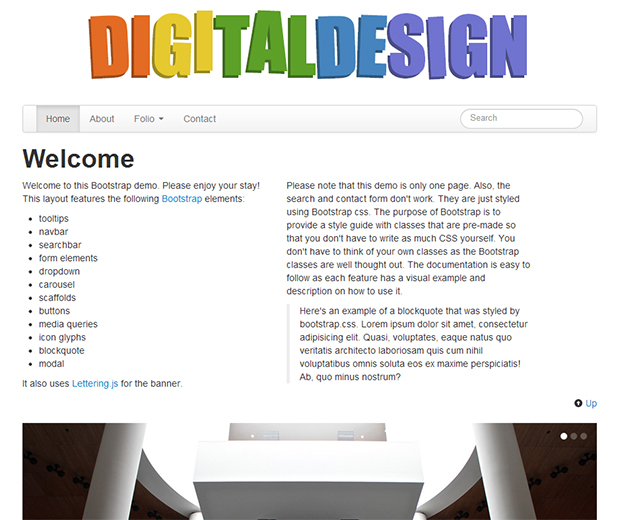
I have a demo below of some of the Bootstrap features in use.
To use Bootstrap, you’ll want to download it from their site and any plugins you want to use, also from their site.
Here’s the basic HTML structure to get started using Bootstrap:
<!DOCTYPE html>
<html>
  <head>
    <title>Bootstrap 101 Template</title>
    <meta name="viewport" content="width=device-width, initial-scale=1.0">
    <!-- Bootstrap -->
    <link href="css/bootstrap.min.css" rel="stylesheet" media="screen">
  </head>
  <body>
    <h1>Hello, world!</h1>
    <script src="http://code.jquery.com/jquery.min.js"></script>
    <script src="js/bootstrap.min.js"></script>
  </body>
</html>
Notice that there’s .min associated with the Bootstrap stylesheet file, the jquery file, and the Bootstrap JavaScript, indicating the compact versions of the code for faster page loads. If you want to make your site responsive like the demo, also include this line after the bootstrap.min.css link.
<link href="css/bootstrap-responsive.min.css" rel="stylesheet" media="screen">
You can use media=”all” if you don’t want to make a separate stylesheet for the print version, or if you don’t care how your pages look printed, you don’t have to worry about it.
Now that you have the main files you need to start building, I’ll go over a few of the features with you.
Navbar
The navbar is as follows:
<div class="navbar">
   <div class="navbar-inner">
      <div class="container">
         <a class="btn btn-navbar" data-toggle="collapse" data-target=".navbar-inverse-collapse">
            <span class="icon-bar"></span>
            <span class="icon-bar"></span>
            <span class="icon-bar"></span>
         </a>
         <div class="nav-collapse collapse navbar-inverse-collapse">
            <ul class="nav">
               <li class="active"><a href="#" data-toggle="tooltip" title="" data-original-title="Sweet home">Home</a></li>
               <li><a href="#about" data-toggle="tooltip" title="" data-original-title="The person behind the site">About</a></li>
               <li class="dropdown">
                  <a href="#" class="dropdown-toggle" data-toggle="dropdown tooltip" title="" data-original-title="Various art work">Folio <b class="caret"></b></a>
                  <ul class="dropdown-menu">
                     <li><a href="#">Sketches</a></li>
                     <li><a href="#">Paintings</a></li>
                     <li><a href="#">Sculptures</a></li>
                     <li class="divider"></li>
                     <li class="nav-header">Gallery Pieces</li>
                     <li><a href="#">Link Gallery</a></li>
                     <li><a href="#">Park Gallery</a></li>
                  </ul>
               </li>
               <li><a href="#contact" data-toggle="tooltip modal" data-target="#contact" title="" data-original-title="Get in touch">Contact</a></li>
            </ul>
            <ul class="nav pull-right">
               <li>
                   <form class="navbar-search pull-left" action="#">
                     <input type="text" class="search-query span2" placeholder="Search">
                </form>
               </li>
            </ul>
         </div><!-- /.nav-collapse -->
      </div><!-- /.container -->
   </div><!-- /.navbar-inner -->
</div><!-- /.navbar -->
The section below is what is used for the menu icon when the menu is collapsed on narrower screens. Notice there’s no image here. It’s styled using bootstrap.min.css. The icon-bar class is used to style the three spans to create the three lines in the menu icon.
<a class="btn btn-navbar" data-toggle="collapse" data-target=".navbar-inverse-collapse">
   <span class="icon-bar"></span>
   <span class="icon-bar"></span>
   <span class="icon-bar"></span>
</a>
This bit was added for tooltip popups for each main menu item:
data-toggle="tooltip" title="" data-original-title="Sweet home"
To activate the tooltip, add this javascript file to your javascript folder. Then add this line below your bootstrap.min.js link:
<script src="js/bootstrap-tooltip.js"></script>
The menu structure is contained within an unordered list in this way (simplified version):
<ul class="nav">
  <li><a href="" class="active">Link 1</a></li>
  <li><a href="">Link 2</a></li>
  <li class="dropdown">
    <a href="">Link3</a>
    <ul class="dropdown-menu">
      <li><a href="">Dropdown 1</li>
      <li><a href="">Dropdown 2</li>
      <li><a href="">Dropdown 3</li>
      <li class="divider"></li>
      <li class="nav-header">Header</li>
      <li><a href="#">Dropdown 1</a></li>
      <li><a href="#">Dropdown 2</a></li>
    </ul>
  <li><a href="">Link 4</a></li>
</ul>
<ul class="nav pull-right">
  <li>
    <form class="navbar-search pull-left" action="#">
      <input type="text" class="search-query span2" placeholder="Search">
    </form>
  </li>
</ul>
I think the class names are self-explanitory, such as nav for the navigation, dropdown for the dropdown menu, and pull-right for placing the searchbar flush to the right of the navigation bar.
If you want to use tooltip with dropdown, then you’ll need to add this jquery:
$('[data-toggle~="tooltip"]').tooltip({ container: 'body' });
$('[data-toggle~="dropdown"]').dropdown({ container: 'body' });
Otherwise, if you don’t have dropdown menus and would like to use tooltips, you only need this:
$('.nav').tooltip('toggle');
Scaffolds
The scaffolding classes are helpful in that you don’t have to worry about styling the widths of containers, as there are set widths that also change when used alongside bootstrap-responsive.css. In my demo, I used span9 for the main container, span4 for the two column containers, and span3 for the three column containers. They float left by default and have a left margin, so you’ll want to use it with the class row to encompass them so that the first column doesn’t indent, but is inline with the rest of the contents. For the main container, I custom styled it in my style.css with float: none; because I wanted it to align to the middle.
Here’s a code snippet of the three column containers to show you what I mean:
<div class="row">
  <div class="span3">
    content
  </div>
  <div class="span3">
    content
  </div>
  <div class="span3">
    content
  </div>
</div>
It really depends on how wide you want the main div container to be to figure out what span number to use for the div containers within it. You’ll have to play around with it to see what works best.
Carousel
To use the carousel feature, download and use this file. Then add this line below your bootstrap.min.js. Add this below the bootstrap-carousel.js to use it:
$('.carousel').carousel();
Here’s the structure needed for the carousel.
<div id="carousel-gallery" class="carousel slide">
   <ol class="carousel-indicators">
      <li data-target="#carousel-gallery" data-slide-to="0" class="active"></li>
      <li data-target="#carousel-gallery" data-slide-to="1" class=""></li>
      <li data-target="#carousel-gallery" data-slide-to="2" class=""></li>
   </ol>
   <div class="carousel-inner">
      <div class="item active">
         <img src="" alt="">
         <div class="carousel-caption">
  <h4>Caption Title</h4>
  <p>Caption description</p>
      </div>
      <div class="item">
         <img src="" alt="">
         <div class="carousel-caption">
   <h4>Caption Title</h4>
  <p>Caption description</p>
      </div>
      <div class="item">
         <img src="" alt="">
         <div class="carousel-caption">
   <h4>Caption Title</h4>
  <p>Caption description</p>
      </div>
   </div>
   <a class="left carousel-control" href="#carousel-gallery" data-slide="prev">?</a>
   <a class="right carousel-control" href="#carousel-gallery" data-slide="next">?</a>
</div>
The class active changes places as the images rotate. The ordered list at the top are the three small circles in the upper right corner that you can click on to jump to a slide. The item divs contain each slide’s information such as the image, the caption title, and the caption description. The last two links are the previous and next buttons. You don’t have to do any styling for the carousel, unless you want to customize it.
Modal
To create a modal like the contact form in my demo, download and use this file. Add this under your bootstrap.min.js:
<script src="js/bootstrap-modal.js"></script>
After that, add this to your jQuery:
$('#myModal').modal('toggle');
Then where you want to use the modal, add data-toggle="modal". In my example, I have a tooltip with the modal like this: data-toggle="tooltip modal". To have the modal work with the tooltip, or if you are using another toggle feature other than tooltip, use this instead of what I just showed you:
$(document).on('click.modal.data-api', '[data-toggle!="modal"][data-toggle~="modal"]', function (e) {
   var $this = $(this)
   , href = $this.attr('href')
   , $target = $($this.attr('data-target') || (href && href.replace(/.*(?=#[^s]+$)/, ''))) //strip for ie7
   , option = $target.data('modal') ? 'toggle' : $.extend({ remote:!/#/.test(href) && href }, $target.data(), $this.data());

   e.preventDefault();

   $target
   .modal(option)
   .one('hide', function () {
      $this.focus()
   })
});
The HTML structure for the modal is as follows:
<div class="modal hide fade">
<div class="modal-header">
<button type="button" class="close" data-dismiss="modal" aria-hidden="true">&times;</button>
<h3>Comment</h3>
</div>
<div class="modal-body">
Enter content here
</div>
</div>
× is used instead of “x” for the close button. The header for the modal is The contents of the modal is in modal-body.
Note: If you want to use other jQuery plugins from Bootstrap, you can do it several ways. One way would be to go to the JavaScript page and view source. Scroll to the bottom and they’re all there. You can also download the plugins along with the rest of Bootstrap from the Customize page. You can customize what features you want to use for your site.
Lettering.js
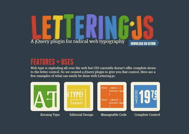
I’m not going to go into details about this, but you can learn more about lettering.js if you’d like. Basically, it’s JavaScript that adds classes to each letter so you can style them. The letters also move when you hover over them. To set it up you’ll need the following:
These are the JavaScript files you’ll need:
This is all the HTML you need:
<h1 id="logo">Text You Want Styled</h1>
This is the jquery snippet for calling the lettering.js:
$("#logo").lettering();
After that you can style .char1, .char2 etc.
As you can see, you really don’t have to write that much CSS when making a site using Bootstrap. You also don’t have to worry about media queries as it’s already taken care of in bootstrap-responsive.min.css. My demo uses some custom media queries though, for features that weren’t included in Bootstrap such as the banner, which uses lettering.js, and the sticky footer.