15th Annual Web Conference April 28 & 29, 2014
I’ve had the privilege of going to my first Web conference for free. While there, I took notes at every workshop and speech I attended. Here I will recount some of the main points for each talk. Hopefully it may be useful to readers, though my notes are somewhat brief.
Opening Speech: How to Stay up to Date (on Web Stuff) by Chris Coyer

Chris Coyer from CSS Tricks came to talk! His presentation was entertaining, though it went on a lot of tangents unrelated to the main point. This is okay though because I’ve gained other insights as a result. The straight forward answer is this though:
- Read books such as The Manual.
- Subscribe to newsletters such as sidebar.io, webplatformdaily.com, cssweekly.com, responsivedesignweekly.com.
- Look at GitHub repositories.
- Be aware of technology you hear over and over.
- Look at the size of the community pertaining to a technology.
- Watch/talk to the big players.
- Subscribe to RSS feeds. Chris subscribes to over 200 of them, but you don’t have to.
Other insights If you’re “old” and using that as an excuse for not learning anymore new stuff, you may actually just be bored. Chris gave examples of old people who have done remarkable things such as getting a 5th level blackbelt, walked across the entire U.S. campaigning for what they believe in, and so on. You should instead, find a way to get excited again. Chris gave some steps to follow to make decisions for a project:
- Get a good night’s sleep
- Gather, clearly lay out all the options
- Consider the outcome of each of those choices
- Pick the best one and go with it, see how it goes
Fast Responsive Design for Higher Education by
This presentation was pretty straight forward with a clear outline, though the responsive design principles mentioned can be applied to any site, not just for higher education, which is great. Responsive design refers to a site whose visual display responds to the device on which it is used. Principles
- Create a great user experience and be extensible/maintainable
- Don’t dumb down the mobile experience
- Prioritize calls to action
- Avoid accidental looks relating to different screen sizes breaking the page. Always appear intentional at all the break points.
Steps
- Wireframe
- Design
- Prototype
- Build and test
Design best practices
- Search
- If your search system has a sidebar with advanced searching options and the viewer is seeing this on a small screen, all those options may take up a lot of space at the top, and users have to scroll down a lot to view the actual search results. Instead, you may consider having that section slide in and out, either with a button or with left right gestures.
- Navigation
- Navigation may use the hamburger icon.
- If there’s a search, that may deserve its own icon.
- Bigger navigation may be hidden and open accordion style.
- Sub navigation on pages may also be hidden and open by clicking on a button.
- Layouts
- Manage white space, don’t fear it.
- Alter the order of content at different break points in terms of importance.
- Use a flexible grid system that works with your site.
- Toggle show hide sections so page isn’t too long.
- Touch
- Hover and click events on the same link is not good. Single tap to open, click again to open link is not intuitive. Instead you may have + and – button beside the main navigation item to open and close sub content, and have » beside the link so users know when you click on it, it links to a different page.
- Use larger touch areas for all views since you can’t assume mobile for touch and bigger screens for mouse clicks. 40px is a good width and height for touch. Anything less than that may be difficult to accurately select links.
- Gestures such as swiping should work when there is a left and right movement such as for a slide show.
- Resolution
- Optimize for higher resolution
- Time-saving tips
- Let principles drive trade-off.
- Prototype to identify problems early.
- Test on most popular devices.
- Avoid reinventing the wheel by following best practices for design.
Start Smarter with a Concept Diagram by Scott Kubie

According to Scott, concept diagram uses nouns connected by verbs to describe a system, idea, or application. It can be a sophisticated deliverable or a quick-and-dirty sketch. The technique is not unlike diagramming sentences in elementary school — though it tends to be quite a bit more fun.
Knolling – Scanning the environment and putting away what you don’t need and organizing everything else
If you have a lot of moving parts in a project, you need to have a solid foundation.
Clarity is empowering.
- Isness versus oughtness
- Where does the project belong?
- Never delegate understanding.
Creating a concept diagram is like taking atoms and molecules to build stuff.
The diagram before the diagram
- Ask a question, model is the answer
- Make a list of nouns and verbs
- Make connections
- Arrange the pieces
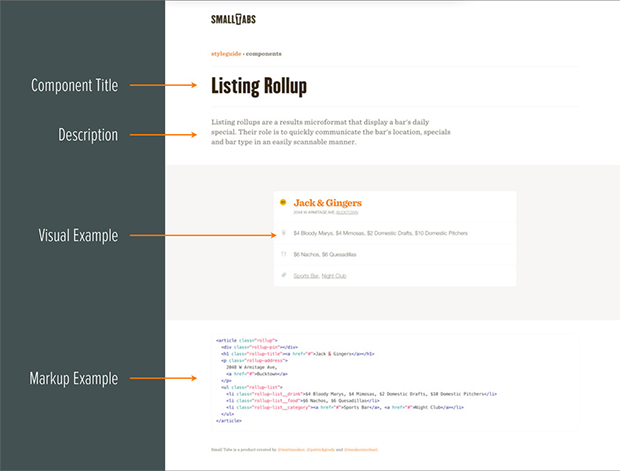
Leveraging Style Guides to Enhance Client Experience by Patrick Grady and Michael Mesker

Making a new site is exciting but there’s also anxiety.
- Where is my old content going to go?
- Is it a large site that could be expensive?
- http://ux.mailchimp.com/patterns
- http://mesker.github.io/smalltabs
Other notes:
- Elements are the foundation of the system.
- Typography is important.
- Components are designed to create the whole template.
- Templates are layouts designed to house specific components.
- A set of connected parts forms a complex whole.
- Design with the entire course of the project.
- Provide a foundation on which the design can grow.
- Working in the medium allows us to build style guides during the design process.
Building the super deliverable
- Reusable modules, scalable modular architecture for CSS
- Smacss.com
- Bem.info
- sass-lang.com
Modular CSS tools
- Lots of imports in Sass
- Jekyllrb.com
- YAML and Liquid
- vinspee.me/style-guide-guide
Tips
- Be resourceful: see if you can hijack something to do what you want.
- Use a tool that increases efficiency with your workflow.
- Be wary of overhead: don’t use frameworks.
- Think open source.
- Client experience is related to client education.
Learn Every Programming Language by Patrick Delancy
If you know more programming languages, you can choose the best one for the project you are working on.
Programming Paradigms
- Procedural
- Logical
- Functional
- Object-oriented
Thinking Procedurally
- Loops
- Goto
- Lexical scoping
- If statements etc
Thinking Objectively
- Class/entity
- Abstraction
- Encapsulation
- Inheritance
- Polymorphism
Thinking Functionally
- Functions as values
- Pattern matching
- Composition
- Partial application
- Monad/computation
- Expression
- Closures
- Deconstruction
- Currying
- Recursion/tail recursion
- Option/maybe
- Cons/car/cdr
Thinking Logically
- Thinking in terms of facts and declarations
- Facts and relationships
- Declarative
